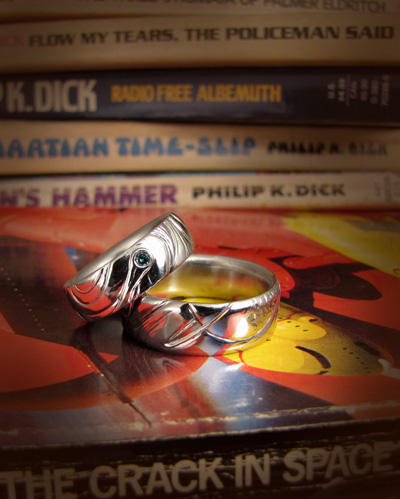
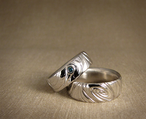
[Platinum, blue diamond, and palladium.]
One of my good friends from way back in high school (hello Facebook!) got a hold of me with a ring idea for her husband. They had been married for some years but never really got nice wedding bands; she thought she would surprise her husband with one for christmas and began scheming up ways to sneak-measure his finger size without him noticing anything. Amusingly, about a week later, he suggested out of the blue that they buy themselves wedding bands for their christmas present that year. Karen, evidently, needs to take lessons in subtlety.
Karen and Jon are both total sci-fi geeks and she thought a spacey sort of theme might be interesting, so I started sketching ideas. I found design inspiration from vintage science fiction cover art—you know all that awesome stuff of dudes in round globular helmets and retro spacecrafts with toggle switches and orange square buttonry, comets flying by in the sky with maybe a ringed planet, red rocky outcroppings, pointy cities.. um, and stuff. (I do love me some retro cover art.)
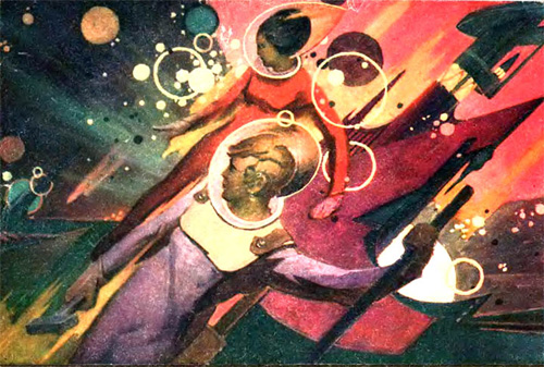
[“Space Workers” by Gennady Golobokov, 1973, Russia. I’m digging the pointy helmet.]
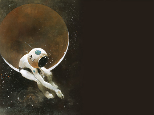
[Isn’t this awesome? It’s Jeffrey Jones’ cover for the Amazing Science Fiction magazine, September 1970.]
The rings are laid out in three sections: ringed planet, spiral galaxy, and comet—with lots of flowy wavy designs between. Karen’s ring is in platinum with a little 2.5mm blue diamond in her comet, and Jon’s ring in palladium (the two metals are almost identical in color but the palladium is not as heavy and not as expensive; for a man’s ring, this helps immensely in keeping the cost from getting ridiculous). Animated gifs of all sides of the rings are here: Karen’s ring and Jon’s ring.
It was the first time I’ve worked the two metals side-by-side and it was interesting to compare how they felt and finished up. Though platinum is a harder and denser metal, I would say that they were equally difficult to finish; palladium is more “sticky” perhaps, and platinum more “dry” feeling. From what I have read, palladium has extremely similar wear characteristics as platinum, which makes it pretty much the perfect white jewelry metal (aside from the hard-to-finish aspect). Both took about a million years to file, sand, sand finer, polish, polish finer, etc. I know Karen has a soft spot for heavy metal so I surfed through my mp3 player for some inspirational music to help pass the time whilst sand-sand-sanding away.
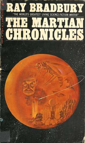
[Ray Bradbury’s Martian Chronicles cover. I also like the Fahrenheit 451 cover; it’s not really spacey, but I liked the look and the abstract reflections in the helmet.]
More totally cool retro cover art from the former Soviet Union & eastern bloc countries here. And some German art here.
Never in my life have I seen anything so cool. Beautiful work. 🙂
Pingback: Sci-Fi cover inspired jewelry | Pulp Archive
Very cool designs. Makes me think about replacing my plain gold band. Maybe a spinning ring to represent Saturn. I love the wavy spirals. very nice work!
Very, very cool. Not my wife’s style, but definitely mine. I’ll try to remember this when we decide which anniversary is worthy of renewing our vows.
Seriously.Cool.
Pingback: Spinning Platinum Wedding Band
Pingback: Wedding rings inspired by vintage science fiction paperback cover art | External Brain
Pingback: vintage jewellery
Pingback: david & aurora’s solar bands « Gin and Butterflies
ÆŠiscover to create himself, the
It’s a plrasuee to find someone who can think so clearly